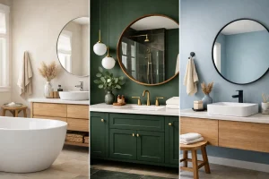

The right bathroom colours can make a compact cloakroom feel calmer, a family bathroom easier to live with, or a dated ensuite feel like part of a much-loved home again. The wrong choice can leave a room feeling cold, cramped or difficult to keep looking clean. That is why colour should be considered alongside lighting, layout, fittings and the way your household actually uses the space.
A bathroom is not a showroom display. It has steam, splashes, rushed mornings and, often, little natural light. A successful scheme needs to look good on day one and still feel right when real life is happening around it.
Start with the room, not a paint chart
It is tempting to choose a favourite shade first, then try to make everything else work around it. In practice, the room itself should lead the decision. Consider how much daylight it receives, whether the window faces north or south, the ceiling height, and where the main light fittings sit. These details change how every colour appears.
North-facing bathrooms often receive cooler light, which can make pale grey, blue and stark white finishes look flatter than expected. Warm whites, soft stone shades, muted taupe or gentle blush tones can make these rooms feel more inviting. South-facing rooms usually have more warmth to work with, so cooler greens, soft greys and blue-based whites can look particularly balanced.
Do not judge samples in isolation. Hold them beside the tile, flooring, vanity unit and worktop you are considering, then look at them in daylight and with the lights on. A colour that looks perfect under showroom lighting may read very differently at home.
Bathroom colours for small spaces
Light colours are a reliable choice for a smaller bathroom, but light does not have to mean plain white. Soft warm neutrals, pale sage, misty blue-grey and creamy off-white can all make walls feel less enclosing while adding more character than brilliant white.
Using a similar tone across walls, large-format tiles and floor finishes can also create a more open impression. When there are fewer harsh visual breaks, the eye travels around the room more easily. This works especially well in an ensuite, cloakroom or bathroom with an awkward shape.
That said, a small room does not have to be colourless. A deeper shade on the wall behind a vanity or inside a shower area can add depth without overwhelming the whole space. The key is balance. Pair a dark green, rich navy or charcoal tile with lighter surrounding finishes, good lighting and reflective surfaces such as a mirror or glazed tile.
Large tiles with fewer grout lines can help a compact bathroom feel calmer and less busy. Wall panelling is another practical option, particularly where easy cleaning is a priority. Choosing panels in a soft neutral or subtle stone effect can give the room a polished, joined-up look without introducing too much pattern.
Choose a mood that suits everyday life
Before choosing individual shades, decide how you want the bathroom to feel. This gives the scheme a clear direction and helps prevent a collection of attractive but competing finishes.
Calm and timeless
Warm white, mushroom, greige, soft beige and natural stone colours create a calm, dependable backdrop. They work well in homes where a bathroom needs to appeal to different members of the household, and they tend to age gracefully. Add warmth through oak-effect furniture, brushed brass accessories or textured tiles rather than relying on a strong wall colour.
Neutral does not mean bland. The difference lies in the layers. A matt taupe vanity, lightly veined porcelain, warm-white wall panels and a darker floor can feel considered and welcoming while remaining easy to live with for years.
Fresh and spa-like
Green bathroom colours remain popular for good reason. Sage, eucalyptus and olive shades bring a relaxed, natural feel without being overly bold. They work beautifully with timber details, off-white sanitaryware and stone-look finishes.
Blue can create a similarly restful effect, particularly in a well-lit ensuite. Softer blue-grey shades feel gentle and classic, while deeper teal brings more drama. Very icy blues can feel cold in a bathroom with limited daylight, so it is usually worth introducing warmer materials or lighting to soften the result.
Characterful and confident
Deep navy, forest green, charcoal and even earthy terracotta can make a bathroom feel distinctive. These colours are often most successful when used with intention, perhaps on a vanity unit, a tiled feature wall or in a spacious shower area.
A darker scheme asks more of the lighting design. Layered lighting around the mirror, in the ceiling and, where suitable, within a niche or cabinet prevents shadows and keeps the room functional for shaving, make-up and everyday routines. Dark tiles can also show limescale and water marks more readily in hard-water areas, depending on the finish. A mid-tone matt tile is often the more forgiving choice.
Let fixed elements guide the palette
Tiles, flooring, furniture and brassware are more costly and time-consuming to change than paint. Choose these fixed elements first, then select colours that support them. This is one of the simplest ways to avoid a scheme that feels mismatched.
Look closely at undertones. A tile described as grey may have a blue, green, pink or brown base. Put it next to a pure white sanitaryware item and the undertone often becomes clearer. If the tile is warm, choose a warm white paint rather than a blue-white. If a vanity is a cool painted grey, a yellow-toned beige wall may clash even if both samples looked attractive separately.
Metal finishes matter too. Chrome suits most palettes and gives a crisp, clean finish. Brushed brass adds warmth to greens, taupes and off-whites. Matt black offers contrast, but it is usually most effective when repeated in a shower frame, handles or lighting rather than appearing as a single isolated detail.
A simple rule is to select one dominant colour, one supporting neutral and one accent material or finish. For example, soft sage can be the dominant shade, warm white the neutral, and brushed brass the accent. This gives the room personality without making it feel overdesigned.
Think about cleaning before committing
A bathroom must cope with moisture, soap residue and daily use, so colour choices should be practical as well as attractive. Pure white grout can look smart initially but may need more attention in busy family bathrooms. A light grey or warm beige grout is often easier to maintain while still keeping the finish bright.
Very dark matt surfaces can show dried water spots, especially around basins and shower screens. On the other hand, pale floors with heavy texture can collect dirt in the grooves. There is no single right answer, but it pays to choose finishes according to who will use the room and how much maintenance is realistic.
For mobility bathrooms, contrast can be a useful design tool as well as a style choice. A clearly defined floor, shower area, grab rail or vanity edge can make the room easier and safer to navigate. Contrast does not need to be harsh. A mid-tone floor with lighter walls, for instance, can offer gentle visual definition while keeping the bathroom calm and welcoming.
Use colour to improve the layout
Colour can help solve visual problems that structural work alone cannot. In a long, narrow bathroom, using a slightly deeper tone on the far wall can make the room feel less tunnel-like. In a room with a very high ceiling, carrying a mid-tone wall colour upwards part way or choosing a warmer ceiling shade can make the proportions feel more comfortable.
A walk-in shower can be made to feel like an intentional part of the room by continuing the same floor tile into the shower area. If you prefer more definition, a complementary tile on the shower wall can create a focal point without breaking up the floor. Niches are a good place for a small accent colour or pattern, particularly if you want personality without committing to a full feature wall.
In family bathrooms, keeping the main surfaces relatively quiet often gives you more freedom elsewhere. Colourful towels, artwork, plants and accessories can be changed easily as tastes shift. This is often a wiser route than choosing a very bold tile across every wall.
See the full scheme before installation
The best bathroom colour schemes are not built from separate decisions. They are planned as a whole, with samples, lighting, storage, showering needs and daily routines considered together. A local showroom visit can make this process much easier because you can compare finishes at a useful scale rather than trying to imagine them from a small online image.
At The Bathroom Magician, this joined-up approach helps homeowners choose colours that work with the property, the practical demands of the room and the finish they want to enjoy for years. No jargon. No stress. Just clear guidance from design through to installation.
If you are torn between a safe neutral and a colour you genuinely love, do not assume the neutral is always the sensible choice. Choose the shade that suits the light, works with durable materials and makes you pleased to open the door each morning. A well-planned bathroom should feel personal, practical and quietly confident.