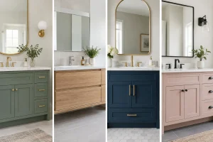

A vanity unit does more than hide the pipework and hold the toothpaste. Its colour often sets the direction for the entire room, especially in a compact bathroom where the basin area naturally draws the eye. When homeowners ask about the best vanity colours for 2026, the answer is less about chasing one passing trend and more about choosing a shade that feels good to live with every day.
For 2026, the strongest bathroom schemes are moving away from stark, showroom-white spaces and towards warmer, more considered colour. Think softened greens, grounded timber tones, rich blue-greys and calm neutrals with enough depth to make the room feel finished. The right choice still depends on your light levels, room size, household and cleaning preferences, but there are some clear directions worth considering.
The best vanity colours for 2026
Warm white and soft ivory
Pure brilliant white can make a bathroom feel crisp, but it can also appear cold under certain lighting. Warm white, ivory and very pale mushroom tones offer a gentler alternative. They work particularly well in family bathrooms, en-suites and accessible bathrooms where a bright, open feel matters.
A warm neutral vanity pairs easily with stone-effect tiles, brushed nickel, chrome and softer brass finishes. It is also a sensible long-term choice if you want the freedom to update paint, mirrors or accessories later without replacing the furniture.
The trade-off is practical rather than decorative. Very light doors can show splashes around handles and lower drawers, particularly in a busy household. Choosing a durable, easy-clean finish and well-designed handles makes a real difference.
Natural oak and mid-tone wood finishes
Wood-effect vanity units remain one of the most dependable choices for 2026. Natural oak, light walnut and mid-tone timber bring warmth to bathrooms that might otherwise feel hard or overly polished. They are especially effective with large-format porcelain tiles, wall panelling and white sanitaryware.
The appeal is not about making a bathroom look rustic. A clean-lined oak vanity with a slim worktop and simple basin can feel contemporary, calm and expensive without becoming overly formal. Mid-tone wood also hides everyday marks better than very pale or very dark painted finishes, making it a practical option for family homes.
In a smaller room, avoid combining a heavy dark timber with dark floor tiles and limited lighting. Instead, balance it with pale walls, a generous mirror and good layered lighting so the room retains a sense of space.
Sage and muted olive green
Green continues to earn its place in bathroom design because it brings a relaxed, natural feel without demanding too much attention. For 2026, softer sage, eucalyptus and muted olive are likely to feel more enduring than bright botanical green.
A sage vanity is an excellent middle ground for homeowners who want colour but are wary of something bold. It sits comfortably beside warm white wall tiles, light stone, oak details and brushed brass. In a period property, it can feel characterful; in a newer home, it adds welcome warmth.
Olive is deeper and more dramatic. It can look superb in a larger bathroom or a well-lit en-suite, particularly with pale walls and a light worktop. In a north-facing room with little natural daylight, however, olive may feel heavier than expected. Samples should always be viewed in the actual room, at different times of day, before a final decision is made.
Dusty blue and blue-grey
Blue remains a bathroom favourite, but the 2026 version is quieter and more versatile. Dusty blue, mineral blue and blue-grey vanity units create a restful, tailored look that suits both traditional and contemporary homes. These shades have enough colour to give the room identity while avoiding the intensity of a strong navy.
Blue-grey works particularly well with polished chrome or nickel, white marble-effect surfaces and pale grey porcelain. It is also a good option where the bathroom needs to feel clean and calm but not plain. For a coastal-inspired scheme, pair it with soft white walls and a subtle timber accent rather than obvious nautical details.
A deep inky blue can still work beautifully, especially on a statement double vanity. It needs contrast around it, though. Pale flooring, good task lighting at the mirror and reflective surfaces will stop the scheme from becoming gloomy.
Clay, taupe and mushroom neutrals
Grey has had a long run in British bathrooms, but cool, flat grey is giving way to warmer neutrals. Taupe, putty, clay, mushroom and soft greige give a vanity presence without making it the focal point. They are reassuring colours for homeowners planning a bathroom to last for many years.
These shades are particularly useful when the tiles already have movement, texture or veining. Rather than competing with a patterned floor or stone-effect wall, a taupe vanity allows those materials to stand out while still looking intentional. It is a refined choice for a main bathroom where different members of the household need to agree on the look.
Not all neutrals are the same. A taupe with pink or yellow undertones may clash with cool grey tiles, while a greige unit can look flat next to cream walls. Looking at samples together is the simplest way to avoid an expensive mismatch.
Charcoal and softened black
Dark vanity units can make a bathroom feel striking and well designed, but black is most successful when it is softened. Charcoal, graphite and black-brown finishes have more visual warmth than a harsh jet black and tend to be easier to live with.
They suit larger bathrooms, cloakrooms and modern wet rooms, where a dark unit can create a confident focal point. Pair charcoal with warm white tiles, a pale basin and either brushed brass or black brassware for a coordinated finish. A timber worktop detail or fluted furniture front can prevent the scheme feeling too severe.
For smaller bathrooms, a dark wall-hung vanity is often a better choice than a floor-standing unit. Seeing more floor beneath the furniture helps maintain an open feel, while the darker colour still gives the room definition.
How to choose a colour that works in your bathroom
The most attractive vanity colour on a showroom display may not suit every home. Start with the fixed elements that are hardest to change: your floor tile, wall finish, shower screen, worktop and brassware. The vanity should connect these choices rather than look like it was selected separately.
Light is equally important. Natural daylight can make pale greens and blues look fresh, while warm artificial lighting may bring out yellow or brown undertones. If your bathroom has no window, lighting design becomes even more important. Well-placed mirror lighting and ceiling lighting can make a deeper colour feel welcoming rather than enclosed.
Then consider how the room is used. A busy family bathroom benefits from a finish that is forgiving around handles and drawers. A guest cloakroom can take more of a design risk. For a mobility bathroom, colour contrast between the vanity, walls and floor may help define the space more clearly, while keeping the overall scheme calm and comfortable.
Storage should also influence the decision. A large double vanity in a muted neutral may feel less dominant than the same piece in a very dark shade. Conversely, a compact single vanity can carry a stronger colour because there is less of it in the room.
Finishes and hardware matter as much as colour
A colour is only part of the final effect. Matt finishes tend to feel contemporary and hide fingerprints more effectively than high gloss, although textured or wood-effect surfaces can require a little more care around grooves. Satin and painted finishes often strike a useful balance between softness and easy cleaning.
Handles and taps can shift the look significantly. Brushed brass warms up sage, oak and mushroom units. Chrome keeps blue-grey schemes fresh and classic. Matt black creates a sharper, more architectural feel, but works best when repeated elsewhere in the room so it does not appear accidental.
At The Bathroom Magician, colour choices are considered alongside layout, lighting, storage and installation details from the outset. That joined-up approach helps avoid a bathroom that looks good in isolation but does not quite work once daily life begins.
The best vanity colour is ultimately the one that suits your home, supports how you use the room and still makes you smile after the novelty has faded. Bring together a few samples, view them under your own lighting and give yourself permission to choose warmth over fashion. A well-planned bathroom should feel like it belongs to your home from day one.